


CI (Corporate Identity)
For a brighter tomorrow for our customers,
we will remain a company that never stops.

-
- SYMBOL MARK
- Symbol Mark

The symbol mark is Mirae Corporation's official emblem, expressing in condensed form the image of a specialized ultra-precision semiconductor company.
The initial "M" in Mirae Corporation's symbol mark directly conveys the image of a semiconductor-related company.
The principle is to use red (Pantone 185C) and black; where unavoidable, such as in four-color advertising media, four-color printing may be used.
Therefore, great care must always be taken to ensure the mark is consistently applied with the same image whenever it is used.When reproducing the symbol mark, always use the master artwork or computer-output artwork from the manual's reproduction materials section to maintain a consistent image.
-
- LOGO TYPE
- Logotype

The logotype is Mirae Corporation's official notation and requires careful attention, as it is a unique, proprietary design that
must never be altered in form under any circumstances.The logotype is used in Black for positive applications and White for reversed (negative) applications; depending on the medium, Silver may also be used.
Use the master artwork or computer-output artwork from the reproduction materials section; where unavoidable, photomechanical reduction or enlargement may be used. -
- COLOR SYSTEM
- Color Guidelines
- Main Color
- Sub Color
- PANTONE 485C PANTONE 294C PANTONE 420C PANTONE 877C
Mirae Corporation's colors are an element that must be used with a consistent image across all media, including advertising and print.
The colors of the symbol and logotype must be expressed consistently across all media, and must be used and managed while maintaining accurate hue, brightness, and saturation.
For offset and gravure printing, spot colors are used in principle, but four-color process printing may be used where necessary to reduce printing costs or
in unavoidable cases such as print media advertising.In addition, silkscreen printing, paint coating, and expressions on materials such as Formica or acrylic must strictly follow the colors specified in the spot-color guidelines.
-
- SIGNATURE
- Signature
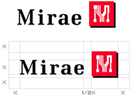
- Horizontal Combination Type
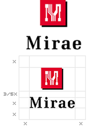
- Vertical Combination Type
Mirae Corporation's signature plays an important role in effectively conveying a professional corporate image, and must always be used
with a consistent image across dedicated media such as advertisements, forms, and promotional items.In particular, arbitrarily altering the size of the symbol or the spacing of the logo eliminates consistency and causes image confusion; to make it easy to apply
across all systems, two forms of signature — as shown on the left — have been developed.Use the master artwork or computer-output artwork from the reproduction materials section for the signature;
where unavoidable, photomechanical reduction or enlargement may be used.Because securing a clear, independent space is important for the signature to accurately convey its image and increase visual recognition,
it must always be clearly separated from the background or other visual elements of the space in which it appears.The height of the letter M — the first letter of the English logo — must be used as the unit "X" for spatial proportions, and no graphic elements may encroach on the defined space;
always secure and use an independent clear space accordingly. -
- PROHIBITION
- Prohibited Uses
-

- Do not tilt at an angle
-

- Do not alter the typeface
-
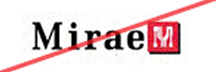
- Do not resize the logo
-
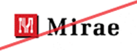
- Do not arbitrarily change the symbol's position
-
- Do not arbitrarily adjust letter spacing
-

- Do not use a reversed shadow effect
-
- Do not change the order of the corporate name
-

- Do not use a background color similar to the symbol
-

- Do not change the symbol's color
-

- Do not change the color of the M within the symbol or the logo color
-
- Do not use a busy background
-

- Do not change the color of the symbol's M