


CI Overview
We will be a company that ceaselessly commits to brightening the future of our customers.

COLOR SYSTEM & SIGNATURE
03COLOR SYSTEM
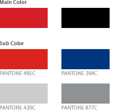
The colors of Mirae Corporation are the elements that are used to give off a uniform image in various media such as advertising and printed media.
The colors of the symbol and logo type must be consistent in all media, and must be used and managed by sustaining precise colors, brightness and chroma.
Spot color printing is necessary for offset printing and gravure printing, but four-color process can be used in printing when necessary, such as when printing costs must be reduced or when using printed media advertising.
Moreover, representations with materials such as silk screen printing, painting, Formica, and acrylic paints must follow the separate guidelines for colors.
04SIGNATURE
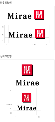
The signature of Mirae Corporation plays a significant role in effectively expressing a specialized corporate image, and therefore must always be used in a uniform image in exclusive media such as advertising, documents and promotional materials.
In particular, if symbol size or logo space is randomly changed, it will result in a lack of uniformity and confusion of images. Therefore, two types of signatures are developed as shown on the left in order to facilitate the application to all systems.
When using the signature, it is necessary to use reproduction material or computer output in the reproduction data section of the manual. It can be reduced or enlarged according to image reprinting if necessary.
It is important to accurately convey the image and secure an independent space to increase visual perception, and therefore the signature must be clearly distinguished from the background of the space or other visual elements.
The height of ‘M’, the first letter of the English logo, must follow the spatial proportion of ‘X’, and that no graphic elements encroach the defined space, thereby securing an independent space.